I've been dreaming of this for so long...
Each new collection highlighted the need to create a site where the clothes would naturally find their place, where the style and colors would resonate with seasonal colors, the softness of the jerseys and the prints.
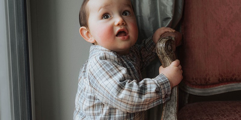
It's difficult to convey the quality and softness of the materials used in each Risu Risu garment without being able to touch them. This was one of the main requirements that guided the creation of the graphic charter.
To talk about organic products, but in a subtle way! Quite a challenge!
This is how the background of the pages became cream to evoke the nature and natural color of cotton before it was processed.
To give an impression of lightness without the whole thing being too childish? That's the reason for the little dots that we find here and there.
The logo has been slightly tweaked without affecting the predominance of the squirrel that we love so much.
Visuals are of course given predominance to do justice to the clothes and to give ample space to the photo shoots.
To highlight the colours of the collections, coloured bands will change over the seasons.